
Table of Contents
- Introduction: Transforming Data into Visual Insights
- Why Data Visualization Matters in 2025
- Essential Data Visualization Techniques
- Design Principles for Effective Visualization
- Top Data Visualization Tools in 2025
- The Data Visualization Process
- Real-world Case Studies
- Common Visualization Mistakes to Avoid
- Emerging Trends in Data Visualization
- Conclusion: From Data to Decisions
Introduction: Transforming Data into Visual Insights
In today's data-driven world, businesses collect more information than ever before. However, having data is only valuable if you can extract meaningful insights from it. This is where data visualization comes in—turning complex data sets into intuitive visual formats that reveal patterns, trends, and correlations that might go unnoticed in text-based data.
Effective data visualization isn't just about making your reports look pretty. It's about communicating information clearly and efficiently, making complex data accessible, and helping stakeholders make data-driven decisions with confidence. Studies show that humans process visuals 60,000 times faster than text, making visualization a powerful tool for insight delivery.
"The greatest value of a picture is when it forces us to notice what we never expected to see." — John Tukey, Mathematician
This comprehensive guide will explore the most effective data visualization techniques, design principles, and tools available in 2025, helping you transform raw data into actionable insights that drive better business decisions.
Why Data Visualization Matters in 2025
As organizations navigate increasingly complex data landscapes, visualization has become more important than ever. Here's why it matters:
Cognitive Efficiency
Our brains are wired to process visual information quickly. Well-designed visualizations leverage this natural ability, enabling faster understanding.
Pattern Recognition
Visualizations reveal patterns, trends, and outliers that might remain hidden in spreadsheets or text reports.
Communication Bridge
Visuals create a common language between data experts and non-technical stakeholders, facilitating better organizational communication.
Decision Acceleration
Well-designed visualizations accelerate decision-making processes by making insights immediately apparent.
Research from the Aberdeen Group shows that organizations using visual data discovery tools are 28% more likely to find timely information than those relying on traditional managed reporting and dashboards. In 2025, with the volume and complexity of data continuously increasing, visualization has moved from a nice-to-have to a necessity.
Essential Data Visualization Techniques
Let's explore the most effective visualization techniques for different data types and analytical goals:
Basic Chart Types
These fundamental visualizations remain the workhorses of data communication due to their clarity and familiarity.
Bar and Column Charts:
Perfect for comparing categorical data and showing rankings. In 2025, interactive bar charts allow for dynamic sorting, filtering, and drill-downs.
Best for: Comparing values across categories, showing rankings, and discrete distributions.

Line Charts:
Essential for displaying trends over time and continuous data. Modern line charts can handle millions of data points with dynamic rendering for smooth exploration.
Best for: Time series data, showing trends, and tracking changes over periods.
Pie and Donut Charts:
While often criticized, these charts still have their place when used appropriately—typically for showing composition with few categories (5 or fewer).
Best for: Part-to-whole relationships with a limited number of categories.

Scatter Plots:
Ideal for showing relationships between two variables and identifying correlations, clusters, and outliers.
Best for: Correlation analysis, distribution patterns, and spotting outliers.

Advanced Visualization Methods
For more complex data and analytical needs, these advanced techniques offer powerful insights:
Heat Maps:
Using color intensity to represent values, heat maps excel at showing patterns in complex, multivariate data. They're particularly useful for large datasets where individual values are less important than overall patterns.
Best for: Correlation matrices, geographical intensity, and identifying hot spots in large datasets.

Tree Maps:
These hierarchical visualizations use nested rectangles to represent both structure and proportion simultaneously. They're excellent for displaying hierarchical data where size matters.
Best for: Hierarchical data structures, displaying size and categories simultaneously.
Network Graphs:
For relationship data, network graphs reveal connections, clusters, and central nodes. In 2025, interactive network graphs can handle millions of connections with advanced filtering.
Best for: Social network analysis, supply chains, and relationship mapping.

Geographical Visualization
When your data has spatial components, geographical visualizations can reveal powerful insights:
Choropleth Maps:
These maps use color or patterns to represent statistical values for defined geographical areas, such as countries, states, or counties.
Best for: Regional comparisons, demographic data, and election results.

Point Maps and Heat Maps:
For precise locations, point maps display individual data points, while geographical heat maps show density and clustering.
Best for: Store locations, event distribution, and density analysis.

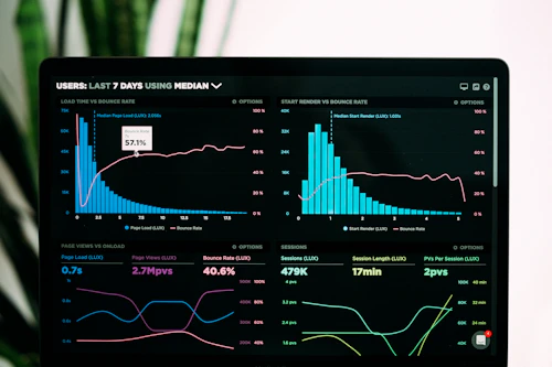
Interactive Dashboards
Dashboards combine multiple visualizations into cohesive interactive experiences, allowing users to explore data dynamically:
Modern dashboards in 2025 feature advanced capabilities:
- Real-time data updates with millisecond latency
- Cross-filtering between visualizations
- Natural language queries ("Show me sales trends in the Northeast")
- AI-suggested visualizations based on data patterns
- Multi-device responsive design for desktop to mobile access
- Collaborative features for team analysis

Modern interactive dashboards combine multiple visualization types
Data Storytelling
The most powerful visualizations go beyond showing data—they tell stories that drive action:
Data storytelling combines three elements:
- Data: The foundation of accurate, relevant information
- Visuals: The effective representation of that data
- Narrative: The context and interpretation that makes it meaningful
"Numbers have an important story to tell. They rely on you to give them a clear and convincing voice." — Stephen Few, Data Visualization Expert
Effective data stories provide context, highlight key insights, explain implications, and suggest actions. In 2025, automated storytelling tools can generate narrative explanations of data patterns, but human curation remains essential for creating truly compelling data stories.
Design Principles for Effective Visualization
Creating impactful visualizations requires more than just technical skills—it demands thoughtful design:
Start with a Clear Purpose
Define what questions you're answering and what actions you want to inspire before creating any visualization.
Simplify
Remove all non-essential elements. Every color, line, and label should serve a purpose. Maximize the data-ink ratio.
Use Color Purposefully
Color should enhance understanding, not distract. Use consistent color schemes with accessibility in mind.
Order Data Meaningfully
Arrange data in logical ways—chronologically, by size, alphabetically, or by importance—to enhance comprehension.
Label Directly
Place labels near the data they describe. Avoid legends when possible by labeling directly on the visualization.
Design for Your Audience
Consider your audience's expertise, needs, and viewing context. Executive summaries need different visualizations than analyst deep-dives.

Before and after: applying design principles to a dashboard
Top Data Visualization Tools in 2025
The visualization tool landscape has evolved significantly, with options for every skill level and need:
Business Intelligence Platforms
Tableau
Still an industry leader, Tableau's 2025 version features enhanced AI capabilities, automated insights, and improved natural language interaction.
Best for: Organizations seeking a mature, full-featured visualization platform with strong community support.
Microsoft Power BI
Deeply integrated with the Microsoft ecosystem, Power BI offers seamless data connections to Microsoft products and strong cloud capabilities.
Best for: Microsoft-centric organizations and teams needing tight Office integration.
Looker
Now fully integrated with Google Cloud, Looker excels at creating consistent metrics definitions and embedded analytics.
Best for: Organizations needing a centralized semantic layer and embedded analytics.
Programming Libraries
Python Ecosystem
Matplotlib, Seaborn, Plotly, and Bokeh offer powerful programmatic visualization capabilities, now with enhanced AI-assisted coding.
Best for: Data scientists and analysts comfortable with coding who need customizable visualizations.
R Visualization
The ggplot2 package remains the gold standard for statistical visualization in R, with new ggvis providing interactive capabilities.
Best for: Statisticians and researchers working with complex statistical analyses.
JavaScript Libraries
D3.js continues as the most powerful web-based visualization library, while newer options like Observable Plot offer simpler APIs with powerful results.
Best for: Web developers creating custom interactive visualizations.
Specialized Visualization Tools
Flourish
Template-based tool that lets non-technical users create sophisticated interactive visualizations quickly.
Best for: Content creators, journalists, and marketers needing quick, beautiful visualizations.
Datawrapper
Simple tool focused on chart creation for digital publishing, popular in journalism.
Best for: News organizations and content publishers.
RAWGraphs
Open-source tool that specializes in creating uncommon chart types that aren't available in standard tools.
Best for: Designers wanting unique visualization types.
The Data Visualization Process
Creating effective visualizations involves a systematic approach:
Define the Question
Start by clearly identifying what questions you're trying to answer and for whom. Is it exploratory analysis for data scientists or a decision-support visualization for executives?
Acquire and Prepare Data
Gather relevant data, clean it, and transform it into a format suitable for visualization. This often involves handling missing values, outliers, and calculating derived metrics.
Choose Appropriate Visualizations
Select visualization types based on your data characteristics and analytical goals. Consider whether you're showing comparisons, distributions, compositions, or relationships.
Create and Refine
Build your visualizations, then iterate to improve clarity and impact. Apply design principles, adjust colors, add context, and ensure accessibility.
Test with Users
Show your visualizations to representative users. Ask: Can they understand the main message? Do they interpret it correctly? What questions does it raise?
Deploy and Share
Publish your visualizations through appropriate channels—dashboards, reports, presentations, or interactive applications—ensuring they reach your intended audience.
Real-world Case Studies
Let's explore how effective visualization drives business impact:
Case Study 1: Retail Sales Performance
Challenge: A national retail chain was struggling to understand regional sales variations and optimize inventory allocation.
Visualization Approach: They created an interactive geospatial dashboard that combined:
- A choropleth map showing sales performance by region
- Time-series charts of seasonal patterns
- Product category breakdowns
- Comparison views of year-over-year performance
Results: The visualization revealed unexpected seasonal patterns specific to certain regions. By adjusting inventory allocation based on these insights, they improved stock availability by 22% and reduced overstock by 15%, resulting in a 7% increase in overall sales.
Case Study 2: Manufacturing Process Optimization
Challenge: A manufacturing company was experiencing inconsistent quality issues but couldn't identify the root causes from their extensive process data.
Visualization Approach: They created a multi-layered heat map visualization that showed:
- Production line performance across time
- Machine temperature variations
- Material batch correlations
- Operator shift patterns
Results: The heat maps revealed patterns not visible in the tabular data—specific combinations of material batches and temperature ranges were strongly correlated with quality issues. After adjusting process parameters, defect rates dropped by 32%, saving approximately $2.1 million annually.
Common Visualization Mistakes to Avoid
Even experienced professionals can fall into these visualization pitfalls:
Poor Chart Selection
Using inappropriate chart types for your data or analytical goal—like pie charts for time series or 3D effects that distort perception.
Truncated Axes
Using non-zero baseline axes in bar charts, which exaggerates differences and can mislead viewers.
Rainbow Color Overload
Using too many colors or inappropriate color schemes that confuse rather than clarify, especially problematic for color-blind users.
Misleading Scales
Using inconsistent or deceptive scales across comparable visualizations, making fair comparisons impossible.
Overplotting
Showing too many data points or series in a single visualization, creating visual clutter that obscures patterns.
Poor Labeling
Using cryptic variable names, missing axis labels, or insufficient context that leaves viewers confused about what they're seeing.

Examples of misleading visualizations and their corrected versions
Emerging Trends in Data Visualization
The field continues to evolve rapidly. Here are the key trends shaping data visualization in 2025 and beyond:
AI-Powered Visualization
AI systems now suggest optimal visualization types, highlight significant patterns, and even generate natural language explanations of key insights.
Immersive Visualization
Augmented and virtual reality enable three-dimensional exploration of complex datasets, creating spatial data experiences that reveal new insights.
Conversational Interfaces
Natural language interfaces allow users to create and modify visualizations through simple conversational commands rather than complex menus.
Real-Time and Streaming Visualization
As data becomes more real-time, visualizations now update continuously with millisecond latency, showing live patterns and anomalies.
Accessibility-First Design
Visualization tools now include features like sonification (audio representation of data), tactile outputs, and designs optimized for screen readers.
Collaborative Visualization
Multi-user environments enable teams to explore data together in real-time, regardless of location, facilitating group insight discovery.
Conclusion: From Data to Decisions
Effective data visualization transforms raw numbers into actionable insights. By following the techniques and principles outlined in this guide, you can create visualizations that not only inform but inspire action.
Remember that the goal isn't to create the most complex or visually impressive chart—it's to communicate clearly and drive better decisions. As information visualization pioneer Edward Tufte said, "The point of the visualization is insight, not technology."
In 2025 and beyond, as data continues to grow in volume and importance, those who can effectively visualize information will have a significant advantage in making sense of complexity and driving data-informed decisions.
"The greatest value of a picture is when it forces us to notice what we never expected to see." — John Tukey
What visualization challenges are you facing in your organization? What techniques have you found most effective? Share your experiences and questions in the comments below.
